The Project
During the initial conversation, the clients’ jump off list was to be Mid Century Modern, a Mad Man feel, have a retro feel and pay homage to local/regional history.
Design Process
The starting point was to do some research the three central areas: retro, mad men and mid century modern. I wanted to get the total picture before starting the design process. From the findings, sketches were made using graphic symbols that could be incorporated with a text treatment.
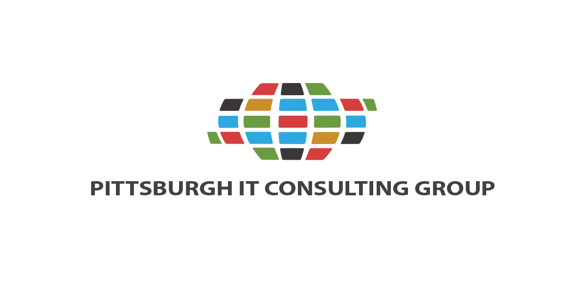
In the end, the client eased back off the retro feel to a more contemporary look. The end choice used the rounded rectangles representing information clustered in a world form. A simple sans serif typeface was incorporated. At the end, this was the best choice to keep the company current looking and not be too “trendy”.
Technologies Involved
- Sketch on paper
- Illustrator
- Photoshop

