The Project
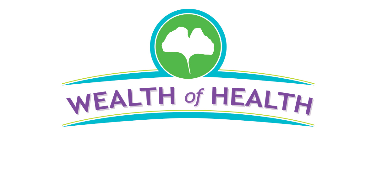
This client wanted a logo for their website. The website educates and inspires adults, children and families to obtain and maintain a healthy lifestyle.
Design Process
The first step was to research symbols of good health. I needed a meaningful graphic image. One that represented the message of the site/blog. I sketched hearts; silhouettes of people, infinity symbols, and then the gingko leaf came to mind. It symbolizes longevity, hope, resilience and peace. This is the true heart of the clients’ intentions.
The graphic gingko leaf was one option. Other options incorporated a heart, a person and items of healthy living along with text treatments. I kept the initial logo designs in black and white so the client could concentrate on the overall logo elements and be distracted by color choices. When a direction was chosen, color would be added.
The gingko logo idea was selected. I explored more variations of this idea. It hit me to curve the horizontal lines making the logo more soothing than the hard straight edge. The client liked this version and we applied a brighter color palette.
The end result was a logo that could be adapted incorporating other symbols of a healthy lifestyle.
Technologies Involved
- Sketches on paper
- Illustrator
- Photoshop


