The Project
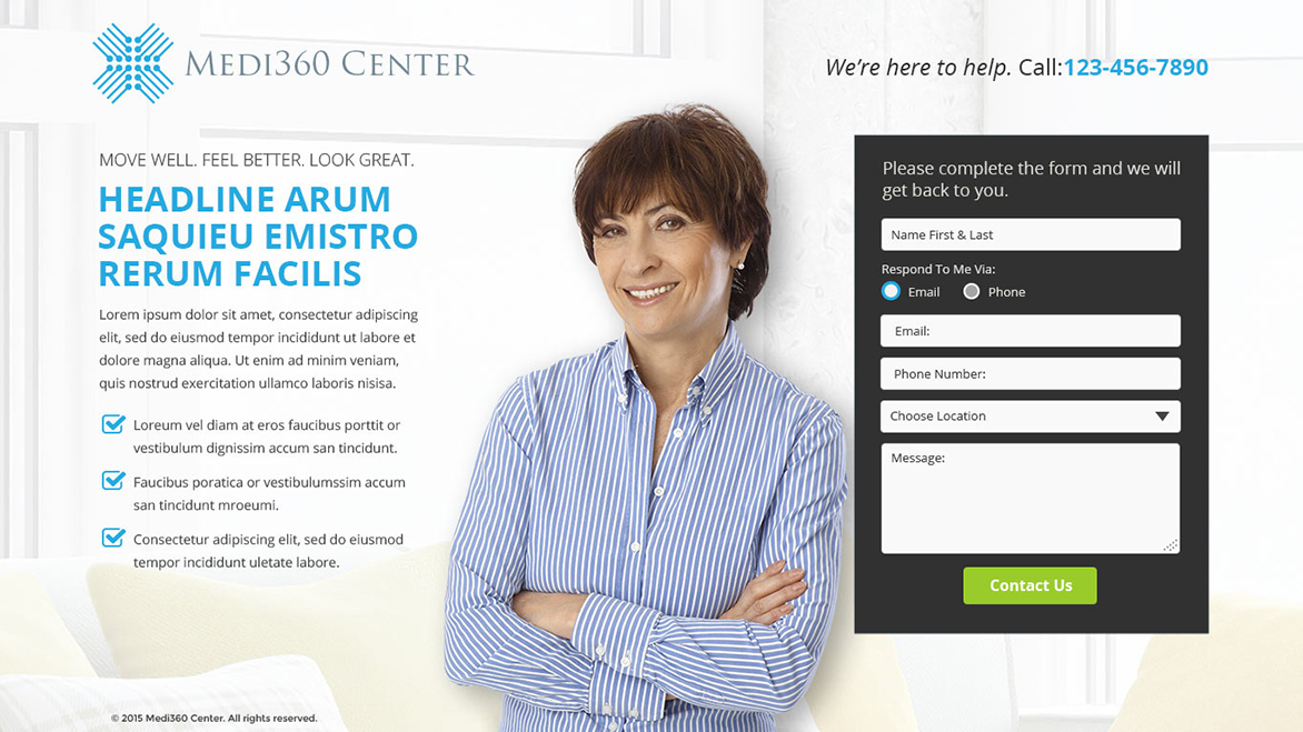
Upon the launch of Medi360 Center website the company had a need for a lead generation landing page to collect information and guide them towards the conversion goal.
Design Process
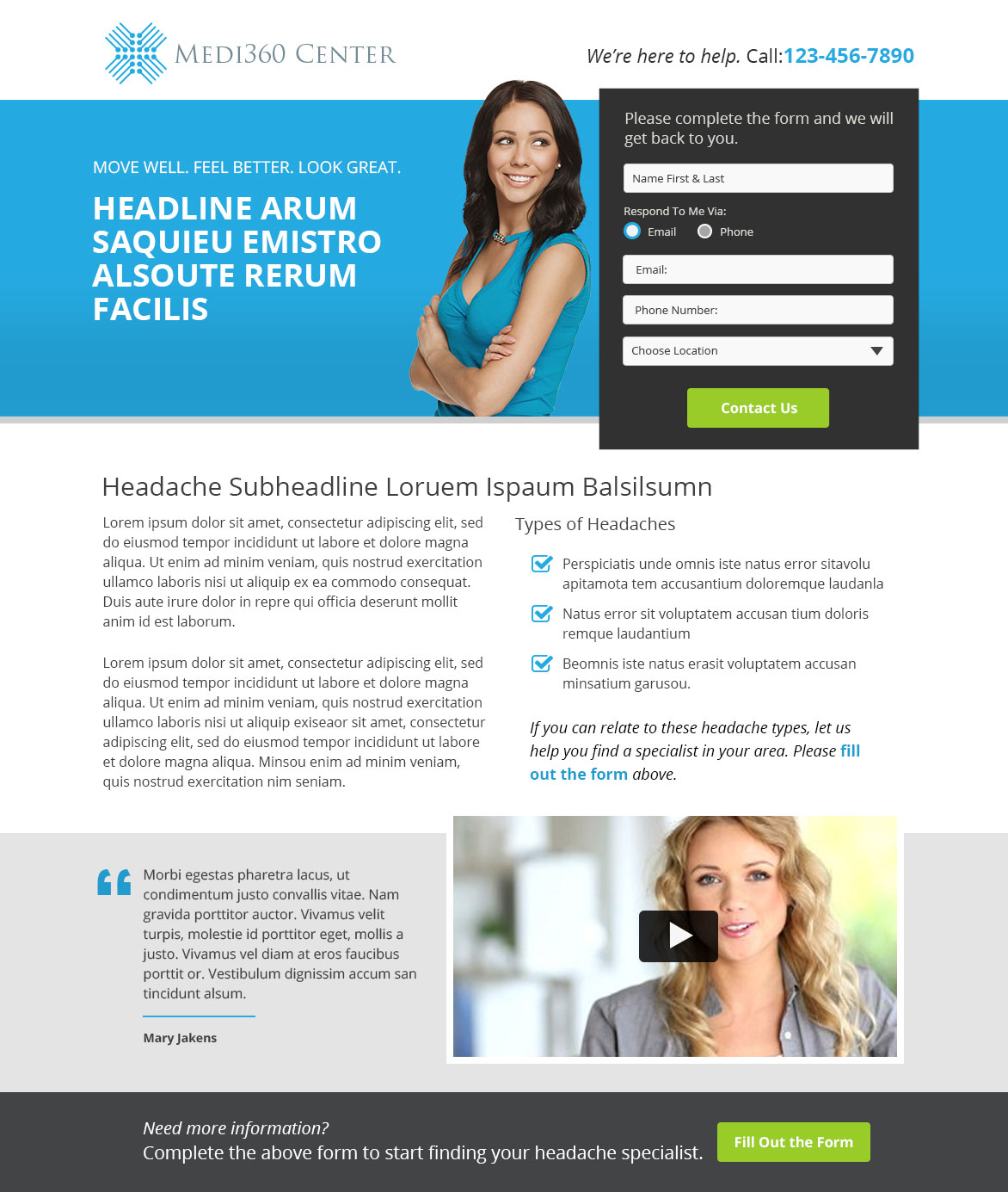
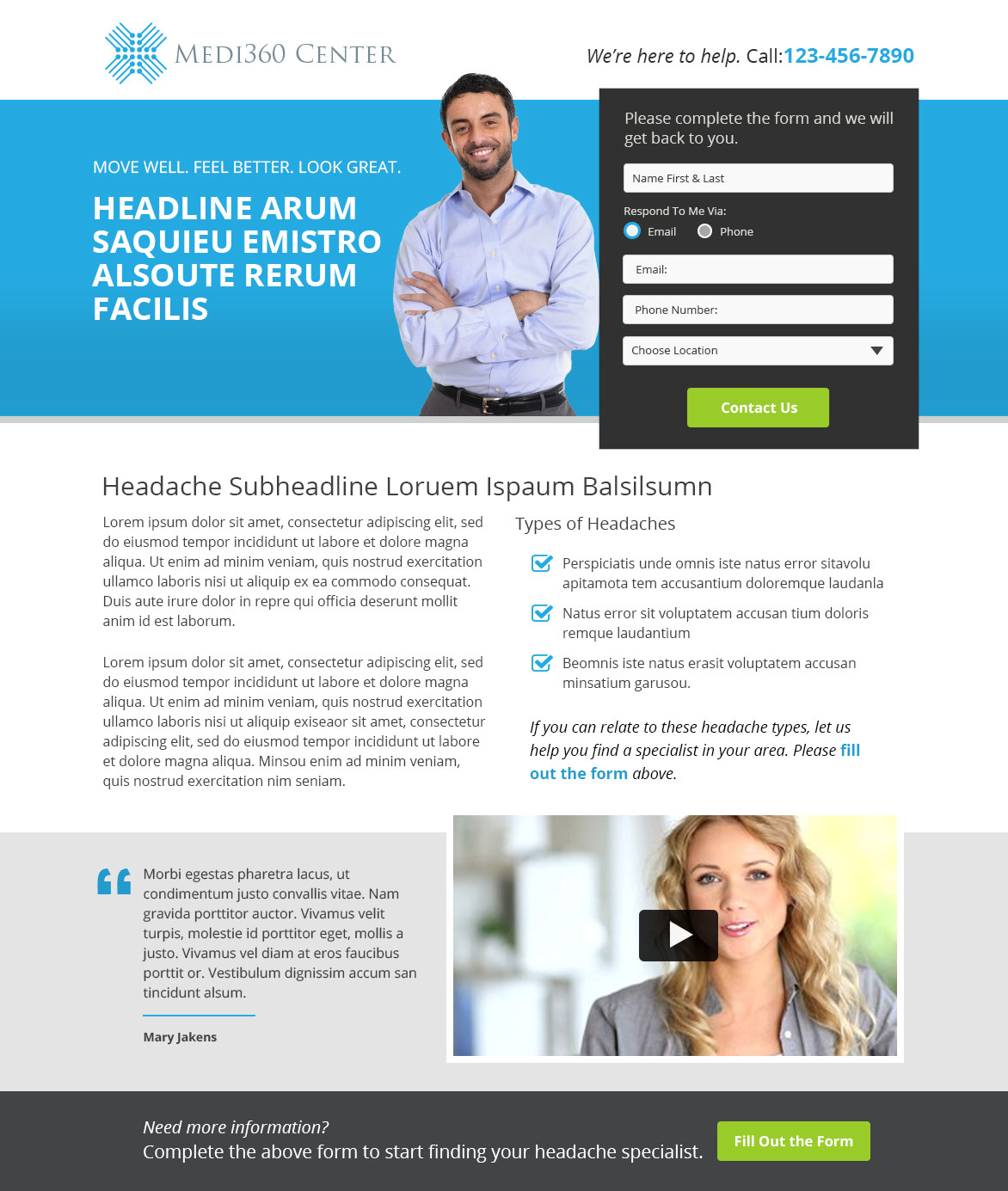
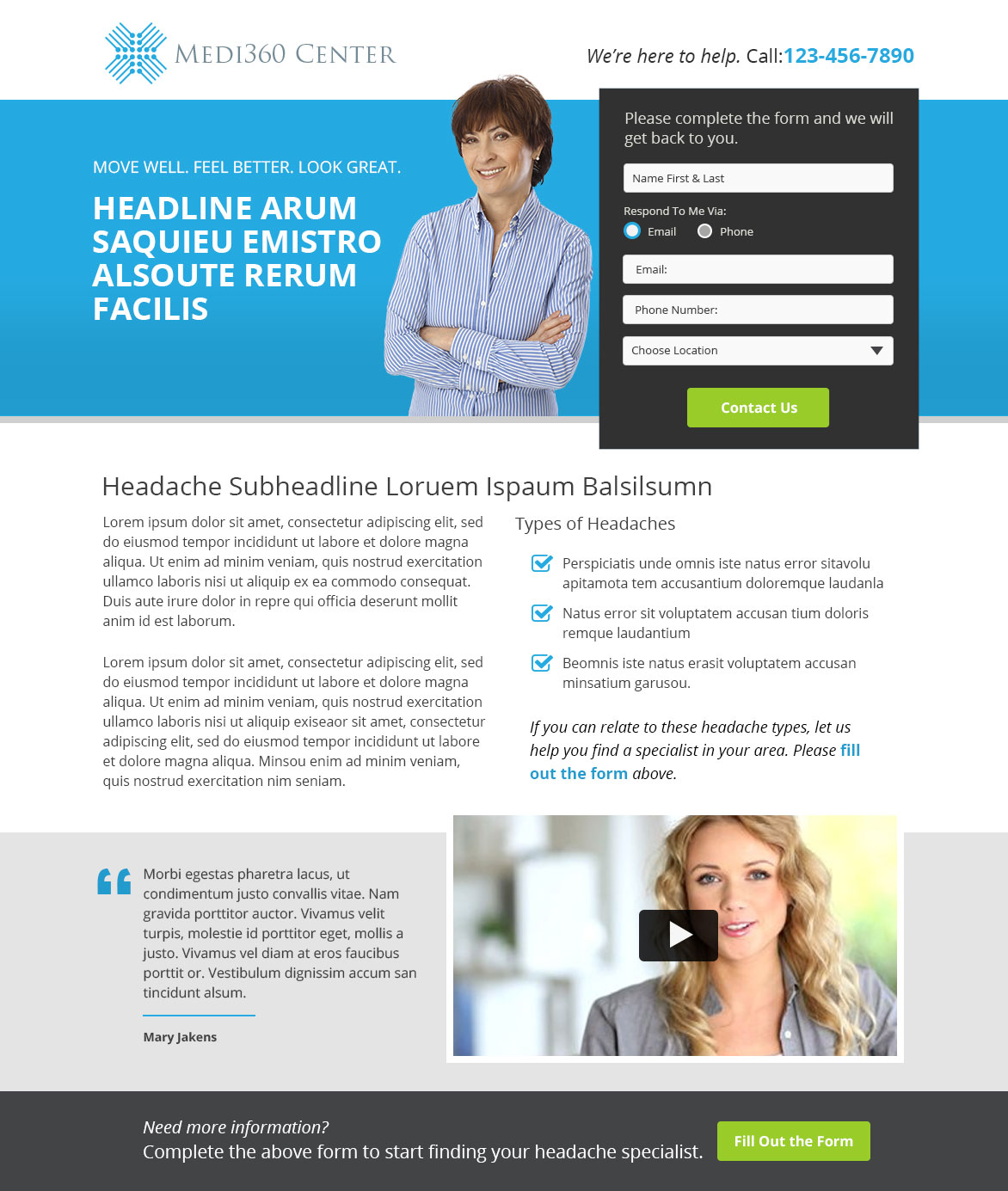
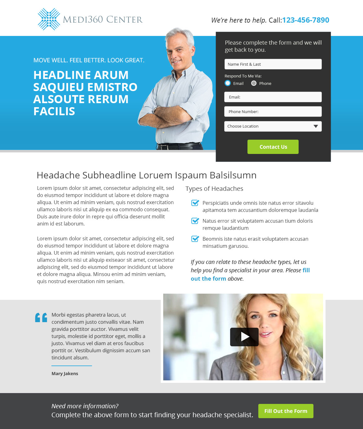
Keeping the main goal in mind to capture information that leads to conversation, the form was big, bold and upfront. Limiting the fields, asking for the absolute minimum amount of information increases the chances that they will complete the form process.
The captured information used to guide the person to the medical facility thus having a successful conversion.
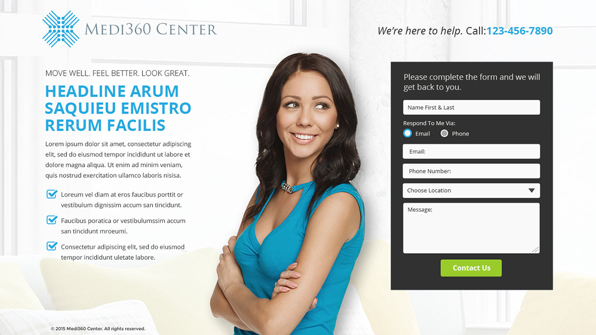
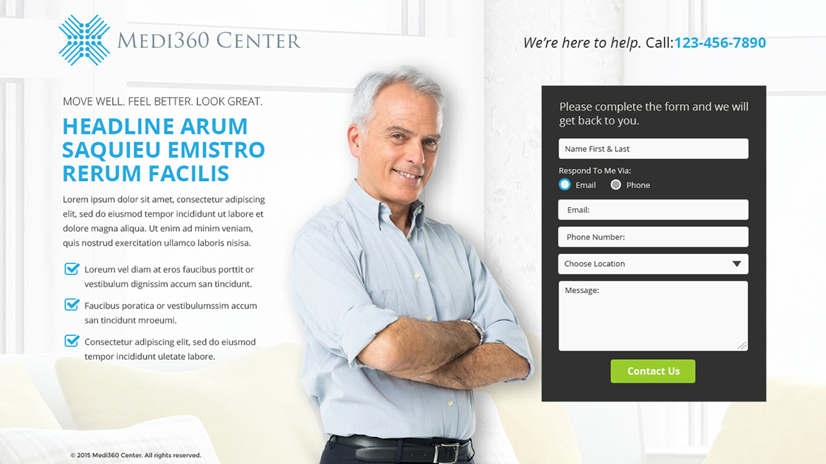
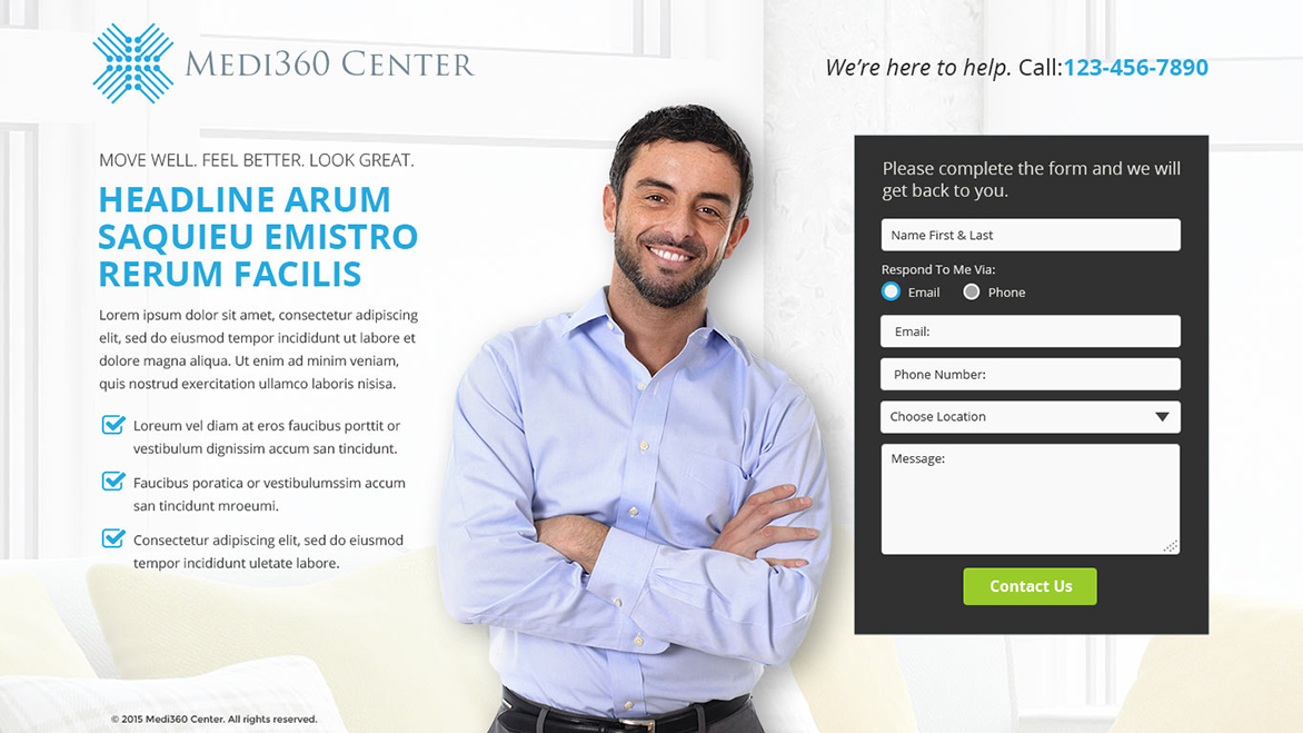
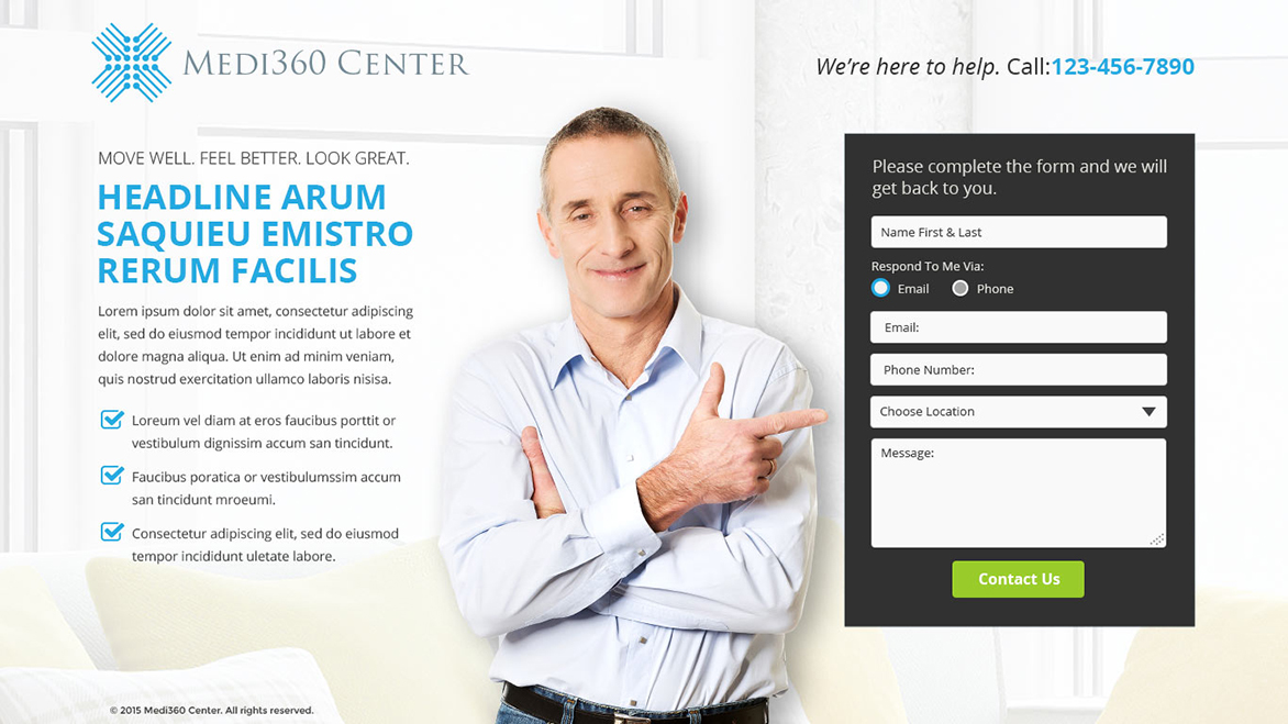
We also wanted to target specific demographics (age & gender) and serve up the appropriate landing page to help them better connect with the process.
Wanting to test out the theory that better conversion happen when the person (image) is looking in the direction of the form. One of the layouts uses such design elements. We’ll see in A/B testing whether this has better conversions.
Two styles of landing pages where developed:
- Full screen landing page with bare minimum information
- Landing page with more information but still keeping in mind with one call to action “fill out the form”
At the end of the day the goal… To fill out the form and convert.

