The Project
Keystone Basement wanted to update their brand and add basement refinishing to their already known basement waterproofing services. They need a well organized site to expedite conversions.
Design Process
Step 1
Started the process with competitor analysis. What to find out: How is the competitors sites organized, What did the competition have/not have that could/would be useful to KBS? What did we need to build into our site to get more conversions?
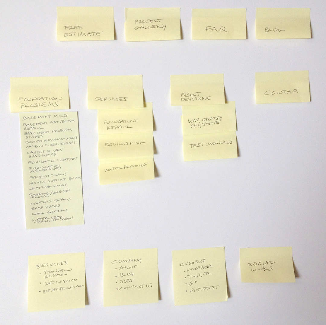
Thinking out the main navigation I wanted to get away from the computer. The main and child items where written on Post-it notes and put on a board. There, I could get a sense of where each item fit into the structure. A Post-it note “card sorting” exercise. Once the team was in agreement of the main navigation the secondary and footer structure was added to the board.
Step 2
An excel sheet with the navigation was made to keep in the document file. This could also be used if we wanted to test the navigation with an online source such as Tree Jack. See what possible users think of the structure.
Step 3
Quick low fidelity sketches where made of the homepage and reviewed with the client. Here we can discuss what items would give the most information and click through.
Step 4
Stay tuned…the wireframes are next.
Technologies Involved
- Good Old Sketching
- Photoshop
- Illustrator


