Brand Development
The Project
The current application was out of date and there were many concerns from the Case Managers the application was unreliable and arduous to use while performing the interviews with the patients.
The health organization needed a modern application to help expedite a patients care.
Human Centered Design
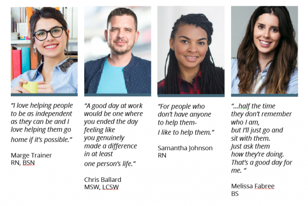
Over the course of two adjacent weeks, the team observed Case Managers performing their tasks and interviewed them regarding their goals and motivations. We observed in Health Facilities and in patient homes.
During our conversations with the Case Managers, they expressed their pain points, concerns using the current application and the needs moving forward on the development of our application.
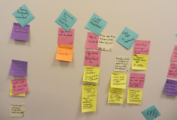
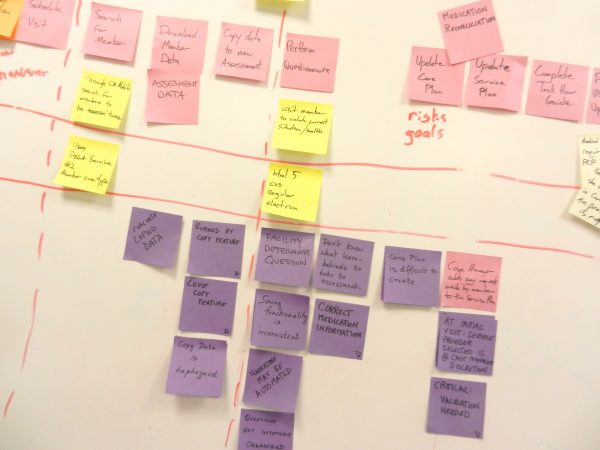
The team set the course to take the Case Managers needs and chart them in an affinity diagram. We gathered the Case Managers observations and group them identifying a common theme(s) and patterns to determine the functions of the applications we are building. We revisited the pain points and concerns and needs expressed by the Case Manager while charting affinity diagram. This information will be most useful while developing the wireframe.
Design Process
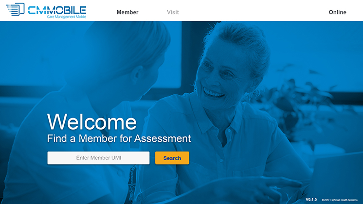
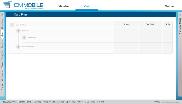
The visual design started with the review of the client’s brand. Making sure the elements where within their guidelines to ensure the design was delivered on point. Visually, the design had to be purposeful, presenting only the information of the task at hand and avoid visual clutter.
- The use of the large image on the opening screen draws the user into the scenario making them have a connection to the application.
- A mostly monochromatic color scheme was used to provide a cohesive look throughout the application.
Technologies Involved
- Photoshop
- Illustrator
- Balsamiq
- Application built using
HTML, CSS, JS (Angular)


