The Project
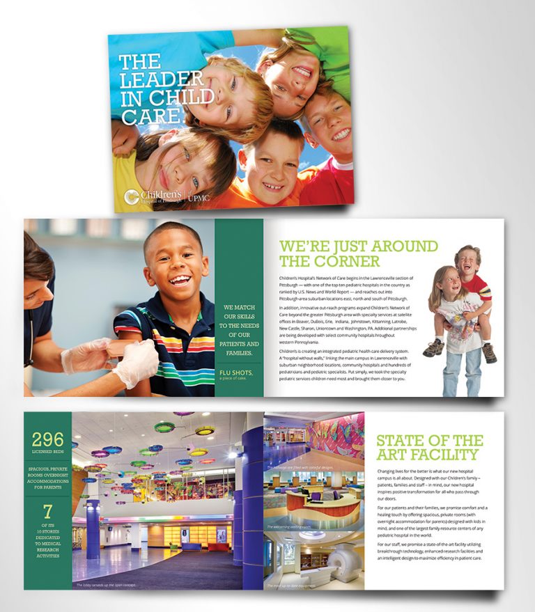
The brochure was produced for a duel purpose, to promote the hospitals new facility and inform of their services. The new building has architectural interest and innovation to use for creative guidance.

The brochure was produced for a duel purpose, to promote the hospitals new facility and inform of their services. The new building has architectural interest and innovation to use for creative guidance.
The brochure design used the established architecture and color scheme. Bright cheerful colors made the brochure exciting and helped the viewer to see that a hospital is not always a “scary” place.
The starting point was to take time thinking about the content and what should be seen as more important on the page. The hierarchy began with consideration of the content and goals. First step, a visual center of interest was created with the large-scale images as the focal point. This adds weight to the page and gives focus to the new aspects of the facility. The images are followed by the headline and body text.
Careful consideration was given to the relationship of the elements in combination with each other. The result, a clear visual hierarchy was achieved by combining thoughtful placement/scale of photos, headlines and readable text.