The Project
The clients business was expanding and they wanted a more polished look to their brand reflecting the improvements being made to the menu and restaurants.
Design Process
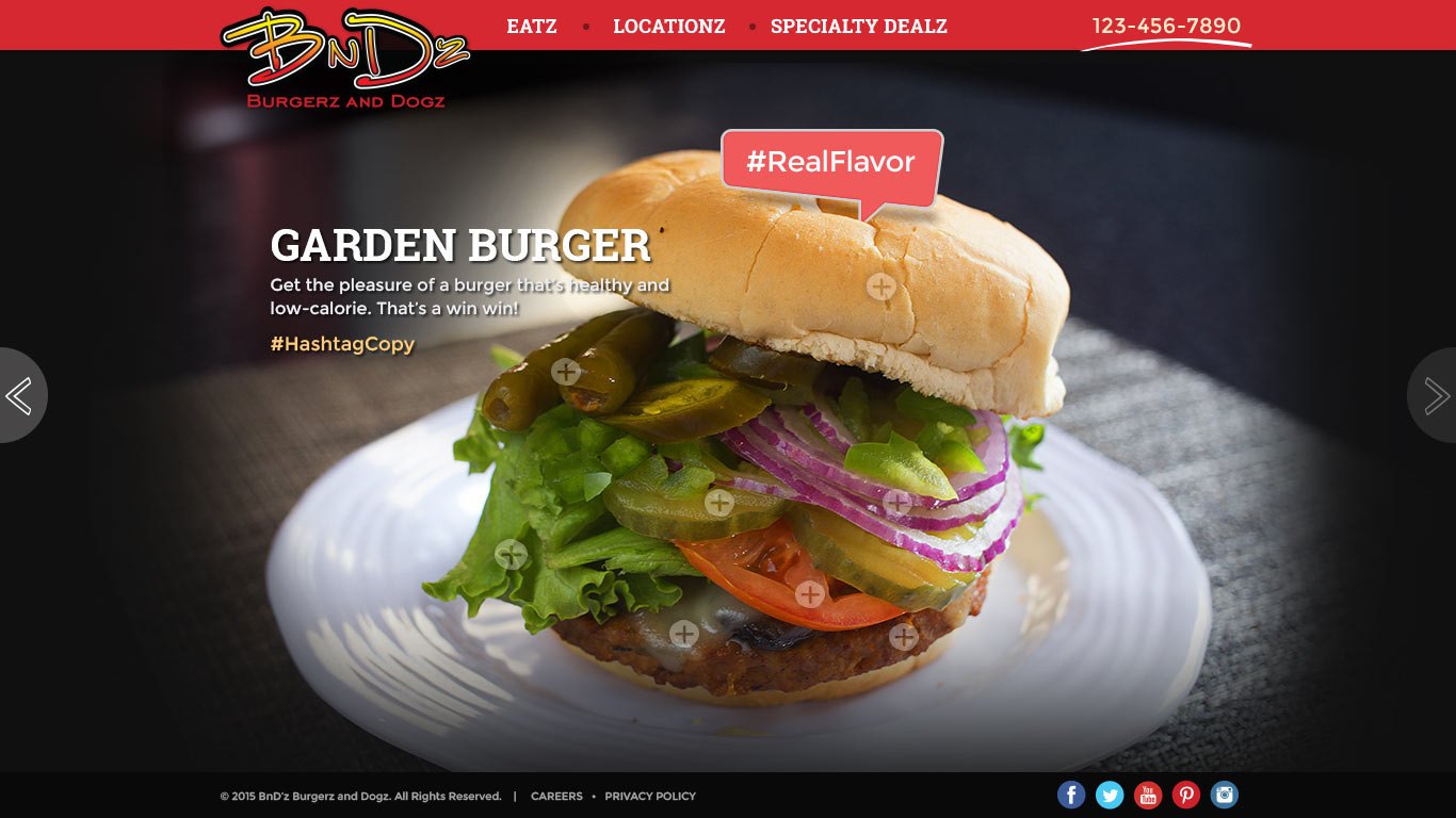
The approach was to keep the site simple and serve up only the needed elements: food, location and deals.
The concentration would be on the food. Show the food upfront and center with great photography. We want the users mouth to water when looking at the images. Their thought… I gotta have me some BnD’z! We wanted to keep the older age group while attracting a new younger crowd.
Presented first were low fidelity sketches to make sure we were on the right track with the design. They loved it. Next step, color mock-ups showing the look and feel of the sight. Clean, modern with a hand-sketched accents.
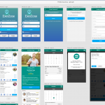
Keeping in mind people are always on the move and search for areas to eat around them, the site a needs to be responsive design with a clean and easily navigated mobile version.
Technologies Involved
- Photoshop
- Illustrator


