The Project
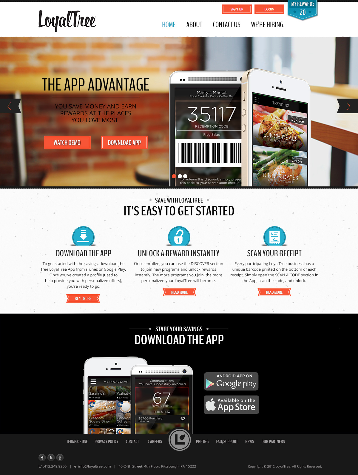
This company had a new design but it lack a visual appeal to take it to the next level. They asked me to take a look, make updates and design the mobile layout.
Design Process
In developing the visual options, I noticed a few UX issues. There was no clear CTA to download the app and no clear hierarchy of information.
The CTA was an easy fix, making a large “Download The App” button using the designated orange link/button color. Viewing a demo is an important way of letting the user know what they will be downloading. I added the “View Demo” button that opens a video overtop the photo and plays in place. The addition of clear product information below the message area reinforces the video and provides links more product information.
The design was updated by presenting the product overview in a clean presentation making it easy for the user.
Technologies Involved
- Photoshop
- Illustrator


